A branding project for Nutrition blogger, Rachael's Good Eats. Rachael started on Instagram while attending grad school and over the course of a year of posting healthy eats quickly grew a huge following of fans. The next step for her growing business was to get a website and blog up and I got to work with her on the branding aspect of this. Rachael described her brand as WHOLESOME, COLORFUL and CLEAN. She wanted her branding to feel easy, balanced and energetic.
We started with a few logo VARIATIONS. These are handlettered to give it a personal feel yet balanced with clean and crisp fonts. Once Rachael decided what she was drawn to most, I dove into her brand board, versions of the logo she chose and some website graphics and elements. Because she is local we also go to meet up and do some photography for her new website.
Includes: Branding Board, Logo, Logo Variations, Web Design Mock Up, and Website Photography
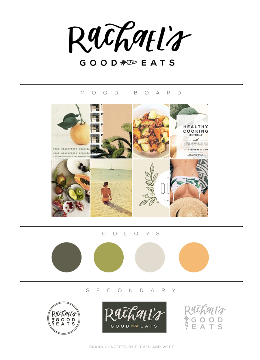
1. BRAND MOOD BOARD
I love mood boards. I make them for almost EVERYTHING. My house had a mood board, then my kitchen had a mood board. My wedding had a mood board then my business had a mood board. Branding boards are essential for staying on track and keeping things cohesive in a world that is overly saturated with ideas.
2. LOGO VARIATIONS
Once we nail down a brand vision and mood board, I go to work. This is sometimes easy and sometimes hard because I'm starting from scratch (literally sat down at my desk with a white piece of paper and pen) I draw pages and pages of sketches and logos, pick some of my favorites ink them and scan them in. At this stage, these are not vectorized. Just scanned and left at a low resolution. I then send these off to Rachael and she gets to put her creative hat on and let me know what she likes, dislikes and which her favorite is.

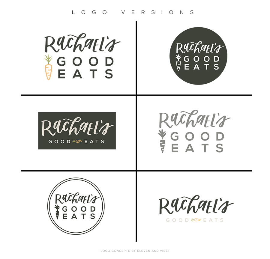
3. LOGO VERSIONS
Once Rachael narrowed in on her logo design, I took that design and cleaned it up. Then I put together a few versions of this logo that she can use in different situations. All 6 of these were finalized and delivered to her in her final brand package.
4. WEB DESIGN MOCK UP
Though I'm not a web developer or web designer, I enjoy laying out websites with the design we come up with. Why this is helpful? I want you to have a vision moving forward, whether it be by yourself or with a website developer, I want you to be able to take what we design and create and turn it into something real. Having a vision for where to take these things can be really helpful. I put together this small blog design for Rachael's Good Eats to help her get an idea of how to use certain design elements we created.

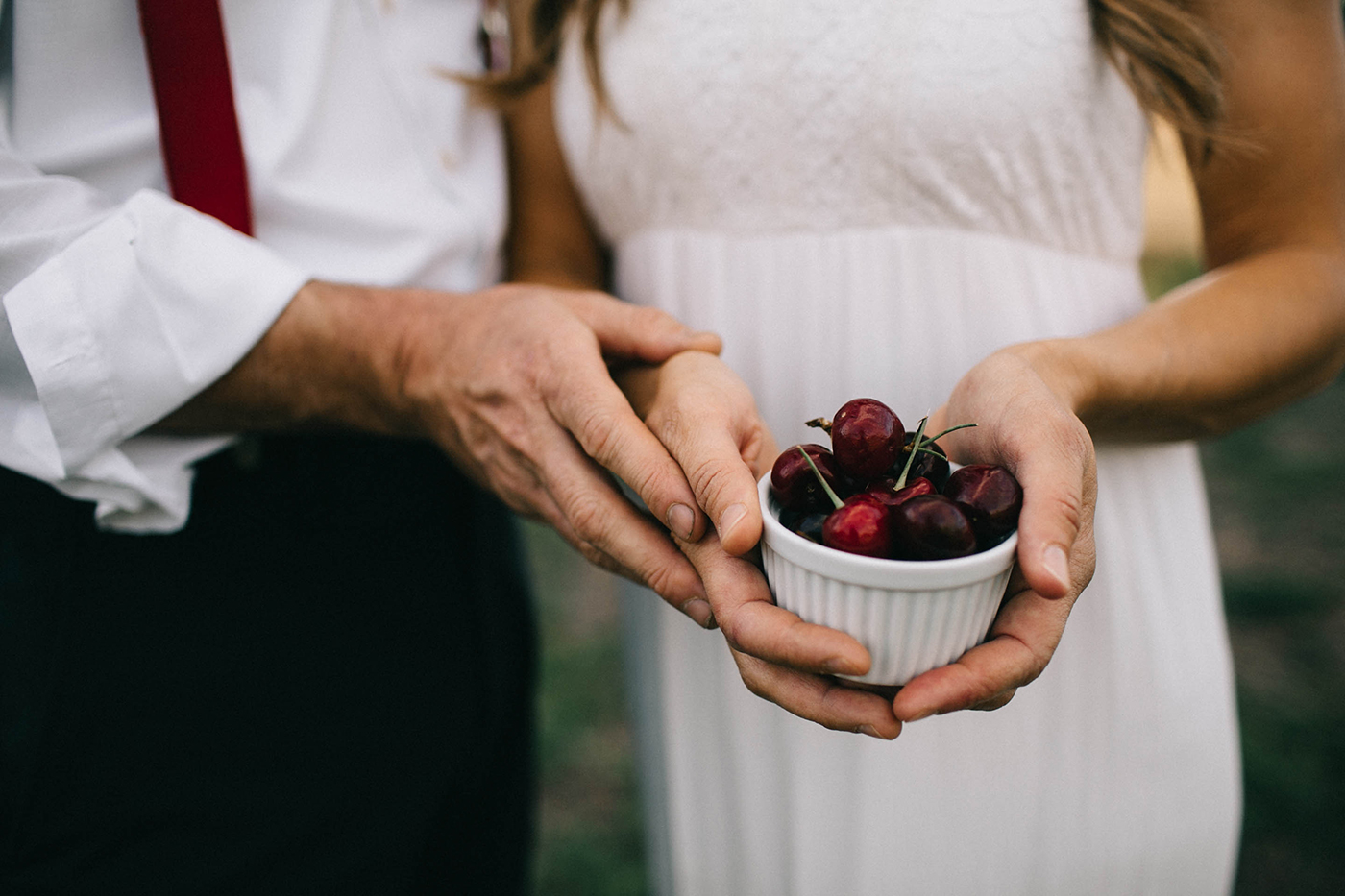
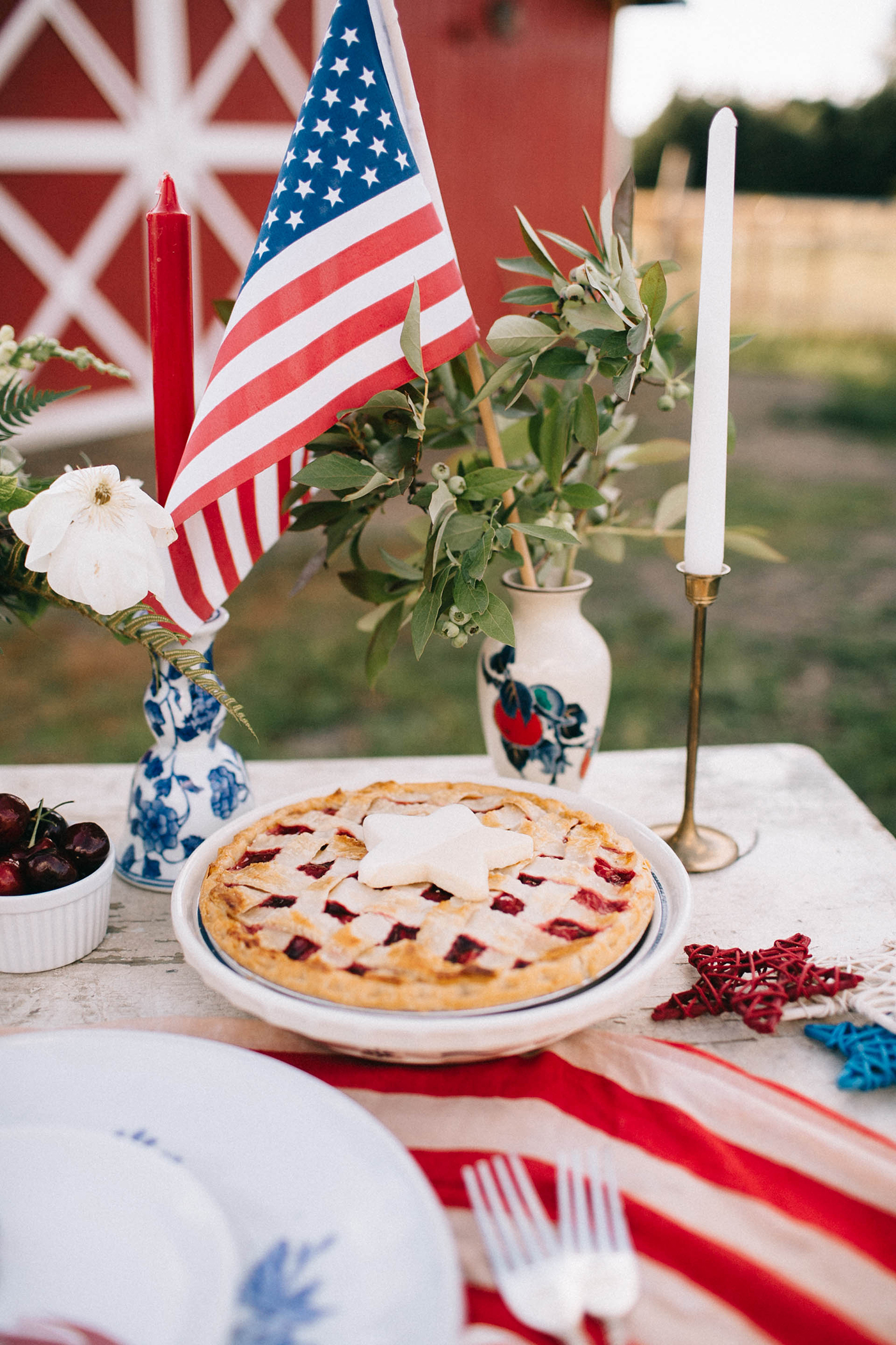
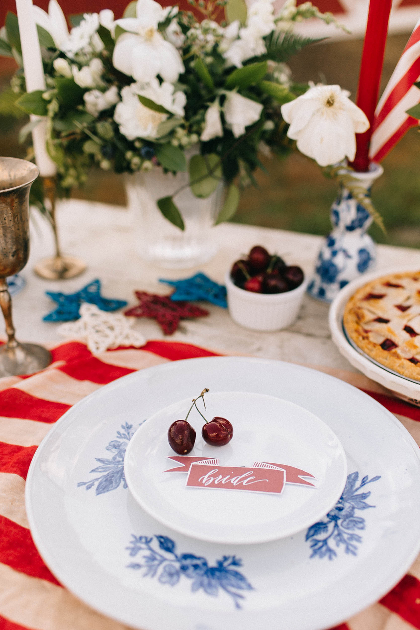
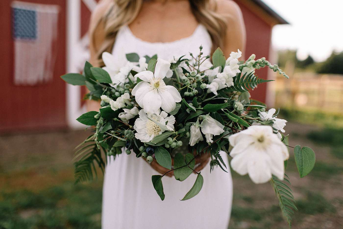
5. WEBSITE PHOTOGRAPHY
Luckily, Rachael is local. AND luckily, we just finished remodeling our kitchen. So it was a WIN WIN! When I first started blogging, the hardest part was always having GOOD web images to use. Whether I was creating an overlay or just a little web banner- it is so helpful to have a library of cohesive imagery to pull from. Rachael and I did a mini photoshoot to kickstart her photo library to pull from as she moves forward with this.

FINAL STAGES: USE IT!
It was so cool to see Our Board Boutique create this custom cutting board using Rachael's new logo! Such a cool and fitting ideas and there are few things I love more than seeing digital designs be brought to real life like this!

Photo via @RachaelsGoodEats